Workforce Operations
Platform
At a glance
Problem
A field worker's shift generated six separate pieces of documentation. None of them started digital, and the agency could not invoice until all six reached a coordinator's desk.
My role
Sole designer. I ran discovery alongside the client, defined the information architecture, designed both surfaces and the design system, and built the working prototype. Two engineers joined after it existed and developed against it.
What shipped
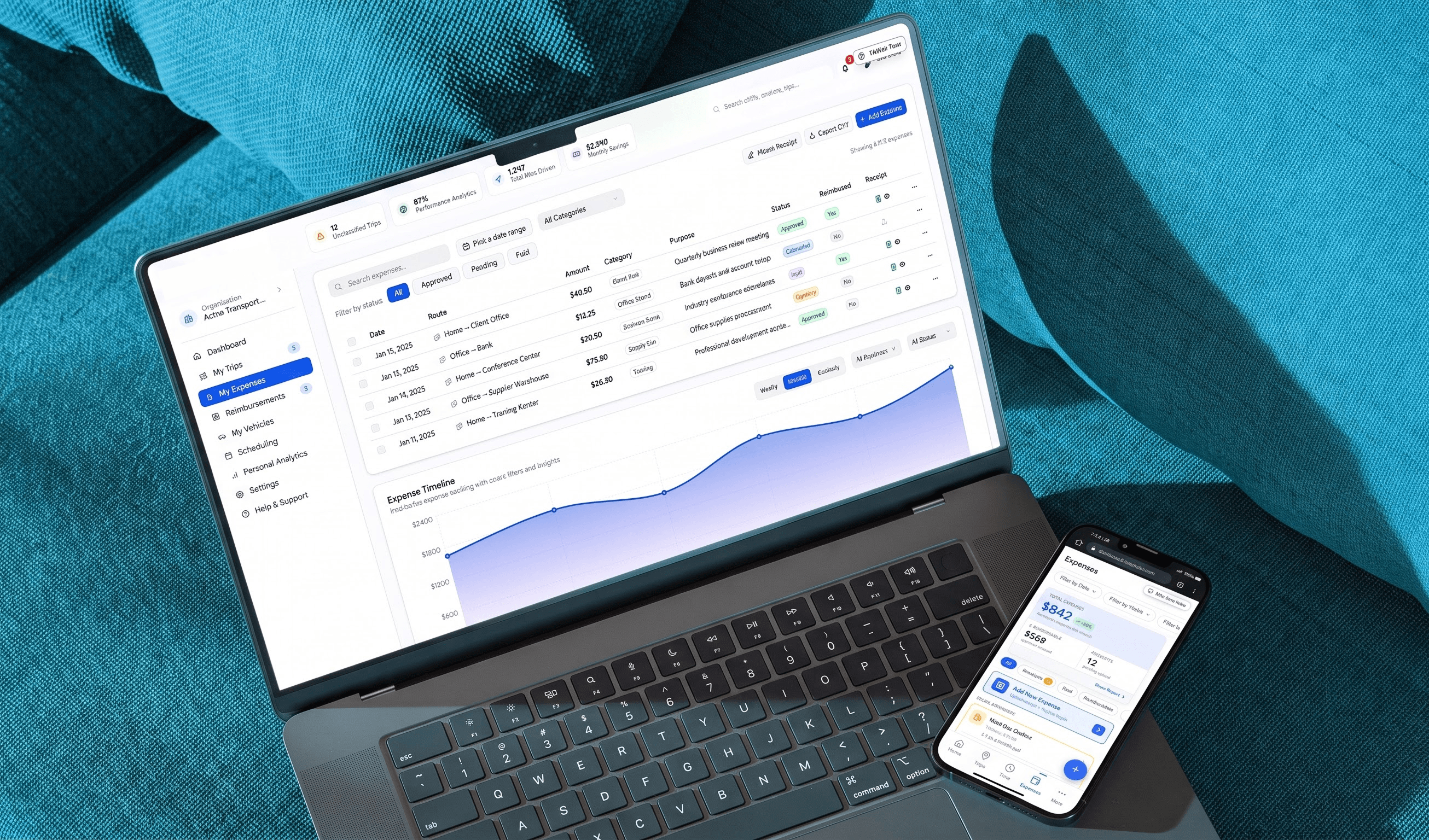
Two surfaces on one data layer: an operations dashboard and a frontline mobile web app covering scheduling, EVV-compliant clock-in, mileage, expenses, and a shift marketplace.
Result
V1 designed and built in 16 weeks. Currently in pre-launch testing ahead of public release.
16 weeks
concept to built V1
4 tools
replaced by one system
2 surfaces
one design system
Before the problem
How this industry actually works
The product serves three verticals, healthcare staffing, logistics and fleet, and field services. Healthcare is the sharpest of them, because here the documentation problem carries federal teeth.
A healthcare staffing agency sits between two parties. On one side are facilities that need qualified staff: nursing homes, clinics, home care clients, anywhere with an unfilled shift on Tuesday night. On the other is a pool of field workers, nurses and aides and drivers and therapists, who work shifts across many sites rather than for one employer.
The agency matches them, proves the work happened, and gets paid for it. The third part is where the business actually lives.
The field worker
Never at a desk. A shift means travelling to a site, working it, and often driving between several in one day. Their phone is the only tool they have with them, usually operated with one hand while carrying something with the other.
The coordinator
Office-based, on a desktop, responsible for filling every open shift with someone holding the right credential, and for spotting a coverage gap before a facility calls to complain about one.
Verification and billing
An agency cannot invoice for a visit it cannot prove happened. For Medicaid-funded work in the US, federal law is specific about what proof means: six data elements captured electronically at the point of care. Miss one and the visit is not billable.
Which produces the constraint that shapes everything else. The paperwork is the product. A shift that was worked perfectly but documented incompletely is, to the business, a shift that never happened.
The problem
Every shift already produced the data needed to bill for it. It just took a chain of paper, people, and days to assemble.
One operational failure appears across three industries: the documentation that proves work happened never starts digital. Healthcare is the most regulated expression of it, and therefore the sharpest, because a visit that cannot be electronically verified cannot be billed at all. Logistics and field services have the same problem with softer penalties: unlogged mileage, lost receipts, and reimbursements that quietly never get claimed.
The client ran a healthcare staffing agency placing field workers into facilities and home visits across the US. The first conversation was not a brief. They had four tools open at once and switched between them mid-sentence describing what a single shift required.
Schedule confirmations lived in a WhatsApp group. Clock-in was a paper sheet at a nursing station. Receipts sat in a personal camera roll. The timesheet was filled by hand and needed a physical supervisor signature, and if the supervisor had already gone home the worker either waited or came back the next day.
Two user groups sat on either side of that gap. Coordinators needed to see coverage, credentials, and compliance across a whole team. Field workers needed to complete one time-sensitive task and get back to work. Neither had a tool built for them.
Stakes
The client described the same pattern every operator in this category describes: invoices waiting on paperwork rather than on the billing system, and workers spending a meaningful part of every shift on documentation that exists only to prove the shift happened. The industry numbers below are what that pattern looks like at scale.
Under Section 12006(a) of the 21st Century Cures Act, Medicaid-funded personal care and home health visits must be electronically verified, six specific data elements captured at the point of care. A visit that cannot be verified is a visit that cannot be billed.
The industry pattern is well documented. Home care agencies see claim denial rates averaging 8 to 10 percent, and incomplete documentation is a leading cause. Agencies target 30 to 45 days sales outstanding; many wait 60 or more.
Six data elements, federally required
The workflow we replaced
- Schedule confirmationWhatsApp group
- Clock-inPaper sheet at a nursing station
- ReceiptsPersonal camera roll
- TimesheetFilled by hand
- Supervisor signaturePhysical, in person
- Mileage logRecorded after the fact
- Coordinator's deskAll six, before an invoice
Supervisor signature: If the supervisor had already gone home the worker either waited or came back the next day.
No two systems in it could talk to each other, so a person had to carry information across every gap.
Landscape
Why not just buy something
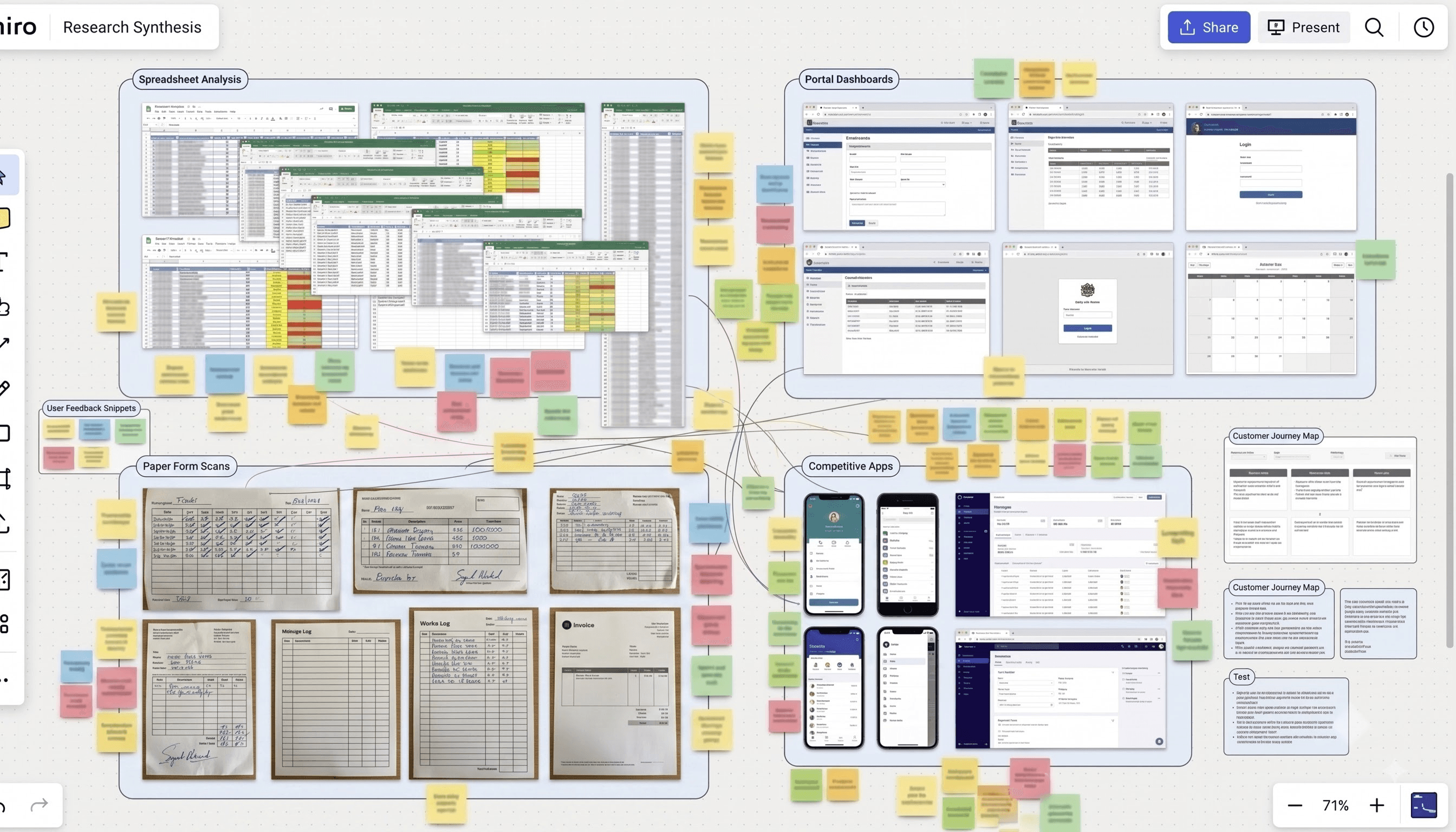
The category is not empty, and mapping it was the first piece of design work I did. Our platform serves healthcare staffing, logistics and fleet, and field services, so the honest comparison spans all three.
Tool
Genuinely good at
Where it stops
Timeero
GPS time tracking, automatic mileage with segmented multi-stop tracking, and scheduling, for home health, medical transport and field teams.
The closest competitor. But no invoicing, no payroll, weak offline behaviour, and reporting too inflexible to build a billing workflow on.
Connecteam
Scheduling, time clock, forms, onboarding and comms for deskless teams.
No automatic mileage and no offline tracking, the two records a day on the road actually produces.
Hubstaff
Time tracking with live GPS and expense capture.
Built around productivity monitoring, so the worker is the subject of the tool rather than its user.
Skedulo
Scheduling deskless work against certifications and skills.
No mileage and no expense capture.
HHAeXchange · Sandata
Deep Medicaid EVV: state aggregator integration and billing authorisation.
Built for the payer. The worker app exists as a reporting obligation.
WellSky · AlayaCare
Genuinely covering the full cycle for enterprise home health.
Clinical record at the centre and back office first, and implementation commonly runs $20K to $400K.
MileIQ · Everlance · TripLog
Mature, excellent mileage capture and tax classification.
Know nothing about shifts, credentials or vouchers.
The gap
The tools that cover the whole cycle are built for the back office, and the worker app exists to feed their record. The tools built for the worker each cover one slice, so the worker still carries three apps. Nobody treats the field worker as the primary user of the entire shift-to-invoice cycle. That is the position our platform took.
Built for the field worker
Built for the back office
One workflow
Full shift-to-invoice cycle
What was already trialled
I ran the competitive evaluation myself before any design work began, using the client's years inside the industry as a map rather than a substitute: he pointed me at the tools he and his contacts were living in day to day, the state EVV portals, the shared spreadsheets, the scheduling workarounds, and I worked through each of them directly.
Research
What I learned, and how
Method
How participants were reached
The client operates inside this industry, which is the only reason this research happened on this timeline. He introduced us directly to agency operators, supervisors, and field staff from his own network, and ran some sessions himself with peers where the existing relationship made the conversation more candid than a cold introduction would have been.
Discovery interviews
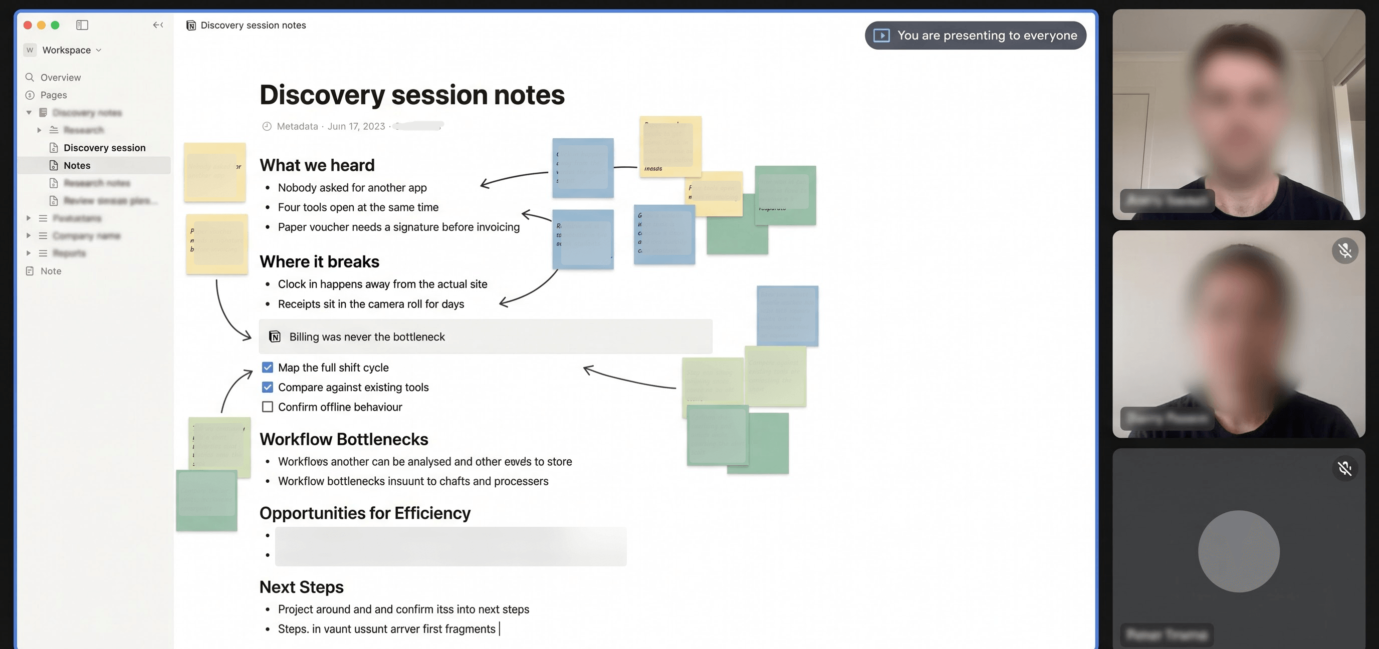
Conversations across both user groups before any design work began, focused on reconstructing a working day in sequence rather than collecting feature requests. What happens first, what happens next, where does it break, what do you do when it breaks. I prepared the questionnaire and ran these directly; others I attended as an observer and note-taker.
Usability testing after MVP1
Once the first build existed, we tested it. Unmoderated remote testing ran in Maze with frontline workers on the mobile flows, plus moderated sessions the client ran in person with supervisors and fleet managers from his network. Two additional interviews with operators on the logistics side. The Maze results are what the testing findings below are drawn from.
Three findings
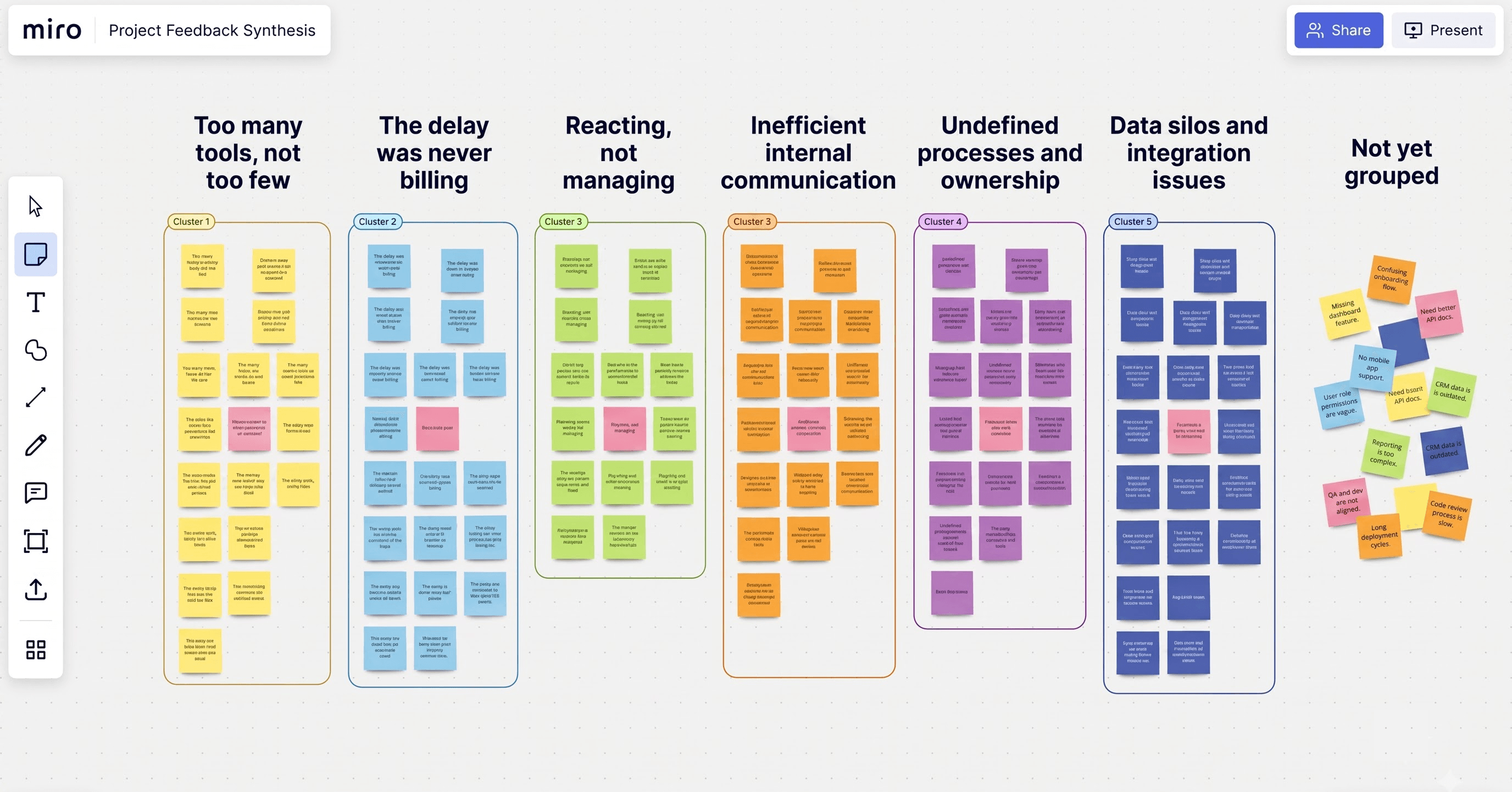
The problem was not too few tools. It was too many.
Nobody asked for an app. Every worker had already built a personal system: WhatsApp messages to themselves as an archive, screenshot folders organized by date, a notebook in a scrubs pocket. They were rational workarounds for a system with no memory, which made the implication uncomfortable: a new tool that covered part of the workflow would become the fifth workaround. It had to replace the whole stack or it would be ignored.
The delay was never the billing software.
The assumption going in was that invoicing was slow because billing was slow. It was not. The billing system sat idle waiting for shift vouchers that were incomplete, late, or physically somewhere else. This reframed the entire product from "make billing faster" to "close the documentation gap," which is a different product with a different primary user.
Coordinators were not managing their workforce. They were reacting to it.
No coordinator had a live view of who was on shift. They learned about problems when a worker called or a facility complained. So the dashboard's job became surfacing problems before they turned into incidents.
The reframe
We assumed
We assumed field workers needed a simpler version of what operations software already looks like.
We found
We found they needed something that required almost no interaction at all.
Two users, one record
The same records seen from two positions.
Coordinator
Field worker
Desktop, at a desk
Mobile, one hand, often outdoors
A 48-hour horizon
A 60-second horizon
Density, pattern recognition, coverage and credentials across a whole team
One visible action, completed under time pressure
Is every shift covered, and by someone credentialed for it?
What do I have to do right now?
A billable record that has to be verified before it can be invoiced
Something that already happened and still has to be logged
What usability testing changed
Workers clocked in at the wrong location without realising it
Round one, frontline workers. Clock-in was a single tap and it recorded wherever the worker happened to be. Several clocked in from a car park or from outside the building without any signal that anything was wrong. In a Medicaid-funded context that is not a data quality issue, it is an unbillable visit, and the failure surfaces at invoicing rather than at the moment it can still be corrected.
Change
A location confirmation step now sits between the tap and the shift start. The app shows the detected site and coordinates, the worker confirms they match, and only then does the shift begin.
Three trip buttons caused hesitation over which to use
Round two, frontline workers. Recording a trip that is starting now, logging one that already happened, and scheduling one for later were three separate entry points. Workers paused over the choice even after repeated exposure, and that pause is the whole problem under time pressure.
Change
A single Record Trip entry on the home screen. The date the worker selects routes them into the right behaviour automatically.
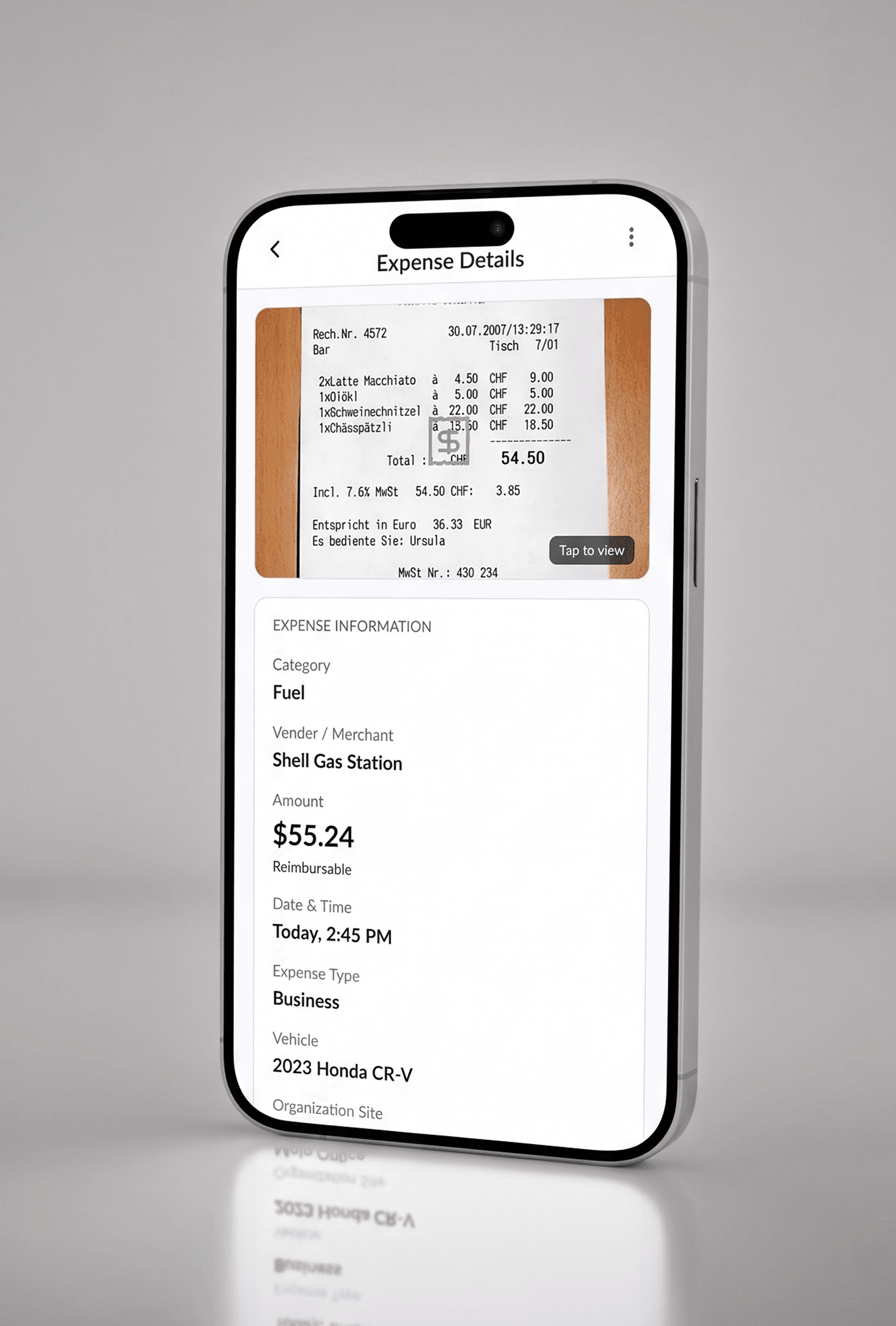
People filled in every field by hand, then realised they had a receipt
Round two, all user types. The expense form asked for category, then amount, then an optional receipt upload at the end. Users typed everything manually and only then noticed the upload existed, having already done the work it would have eliminated.
Change
The receipt moves to step one. OCR reads it and pre-populates category, amount, and merchant, turning data entry into verification.
Limitations
Participants came through the client’s network and the sessions were remote. Both limit how far the findings generalize, so no single account carried weight on its own, only patterns that repeated across every conversation.
What surprised me
Where the delay actually lived. The bottleneck was three steps upstream of the billing system, in the hands of the person least equipped to fix it: a worker standing in a car park at the end of a twelve-hour shift with a paper form and no supervisor to sign it.
That moved the primary user of a billing problem from the finance team to the field worker, which is not where anyone expected the product to end up.
Constraints
The four things that were not negotiable
Four constraints were fixed before a single screen was designed.
EVV compliance is not a feature
Federal law requires six data elements captured electronically for every Medicaid-funded visit. It was the reason the product existed.
One hand, ten seconds
Nurses carry things. Drivers have a hand on the wheel. The standard SaaS assumption of two free hands and a quiet room was wrong for every field user. Every primary action had to be reachable and completable one-handed, under time pressure, often outdoors.
Connectivity is not guaranteed
Care facilities, basements, rural routes, hospital car parks. Any critical action that required a live connection would fail exactly when it mattered.
Two opposed users, one data layer
A coordinator needs density, pattern recognition, and a 48-hour horizon. A field worker needs one visible action and a 60-second horizon. The same underlying records had to serve both without asking either to think like the other.
Technical constraint
Two engineers. Every scope decision had to account for that. Features that looked cheap in Figma and expensive to build got cut early rather than late.
The product
What it turned into
What you are looking at
This is the interactive prototype, built from the same Figma file and component library the engineering build was developed against. It runs on representative sample data rather than a live backend. The production build is complete and currently in pre-launch testing with the client’s agency network, with public release expected within a couple of months. Real workforce and patient records are not shown here.
Two product areas, one shell
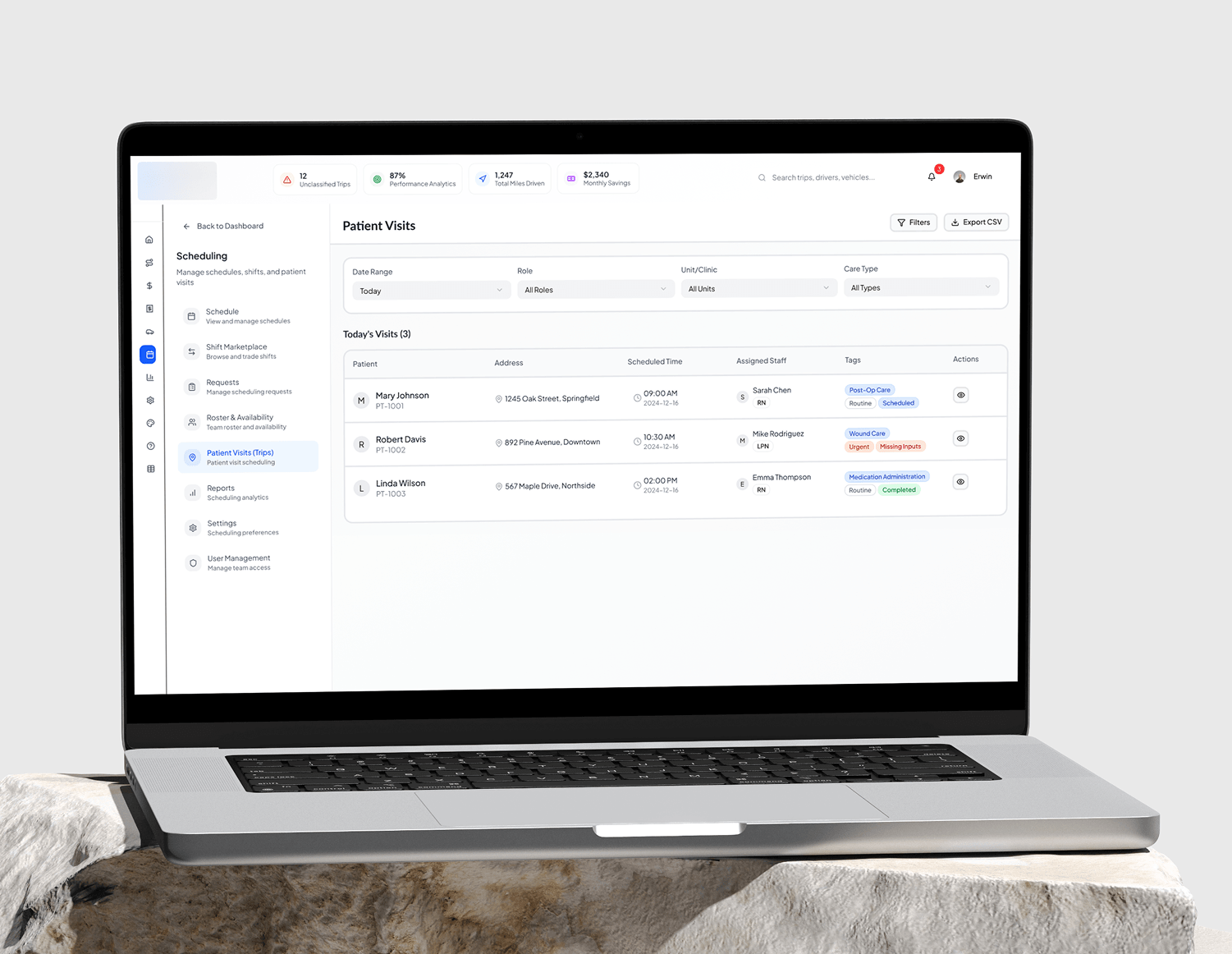
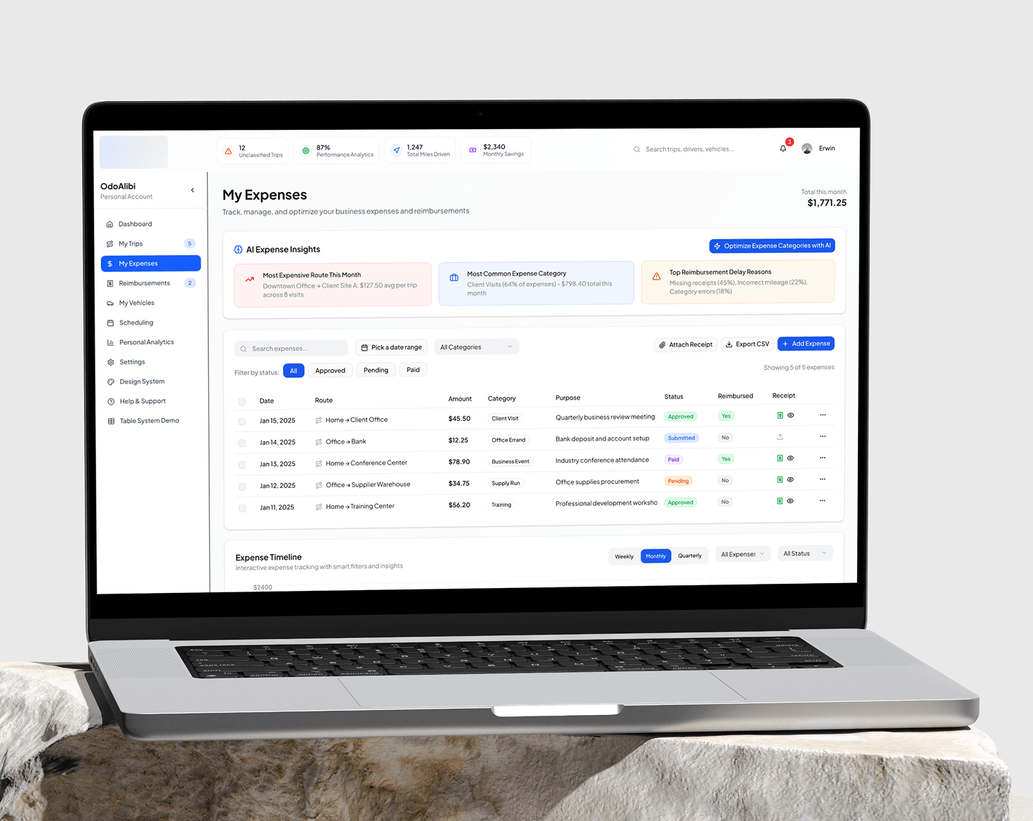
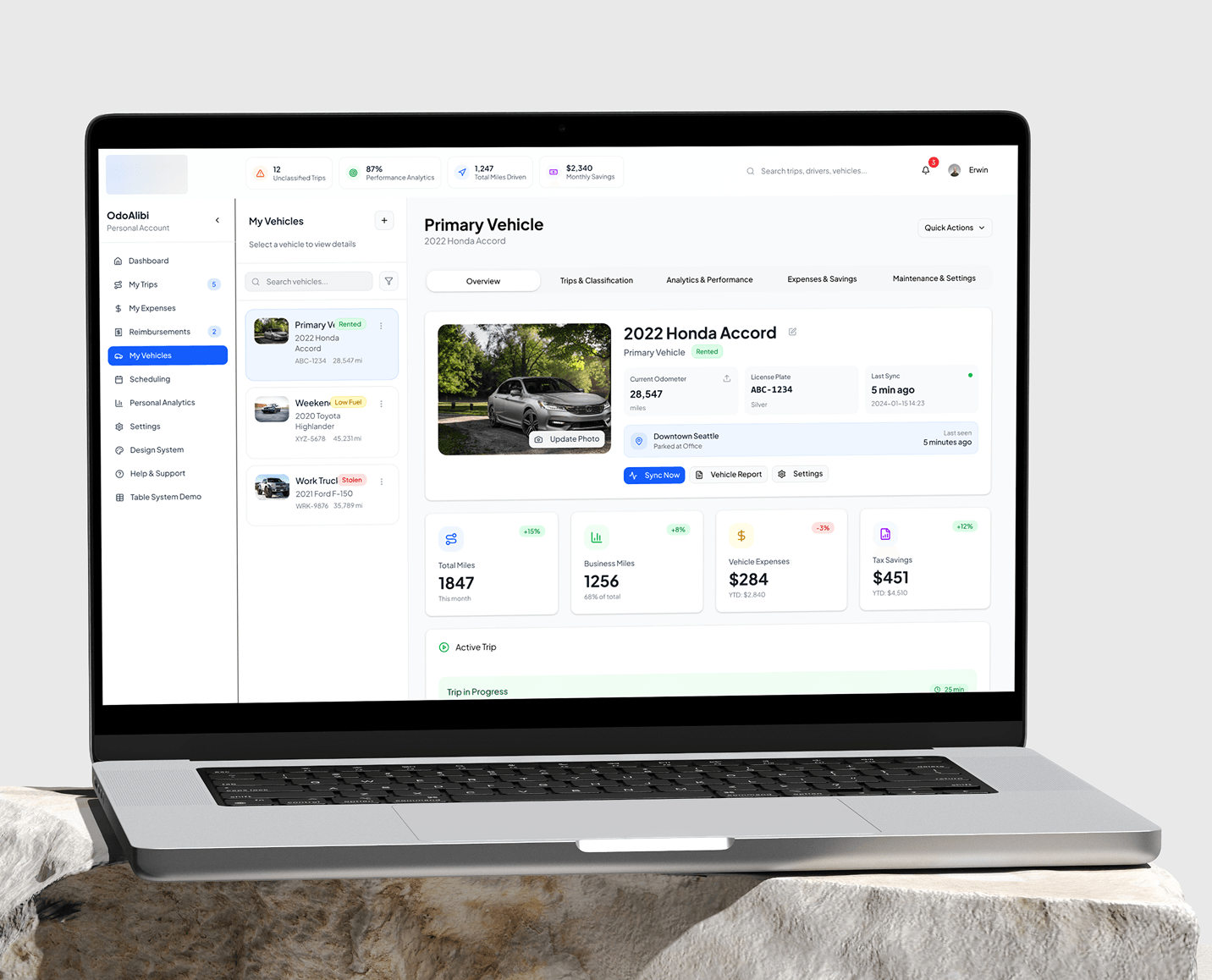
The dashboard carries two distinct product areas behind one navigation. The personal side handles trips, expenses, reimbursements, vehicles and analytics, with every trip classified business or personal for tax purposes. That is the logistics and field services product. Scheduling opens into what is effectively a second application, with its own navigation: schedule, shift marketplace, requests, roster and availability, patient visits, reports, and user management. That is the healthcare staffing product.
They share a data layer, a component library, and a shell. Keeping them coherent without collapsing them into one generic tool was the central architectural problem.
Three roles
Frontline Worker
Nurse, driver, field staff
Mobile web app
Operations Admin
Scheduler, manager
Web dashboard
Approver and Supervisor
Compliance, finance
Both surfaces
Both surfaces run in the browser today. The mobile experience is a responsive web application rather than a native app, dedicated iOS and Android apps sit on the roadmap.
Dashboard · Scheduling
The healthcare staffing product
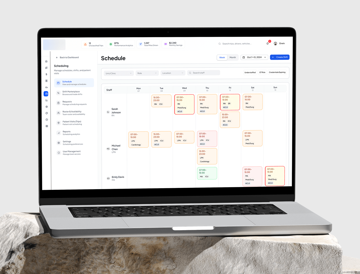
Weekly grid
Staff as rows, days as columns. Shift blocks carry role and unit, RN, LPN, MA across ER, ICU, Med/Surg, plus credential tags like ACLS and Cardiology.
Coverage filters
Understaffed, OT Risk, Credentials Expiring. Coverage problems are surfaced as filters rather than buried in a report.
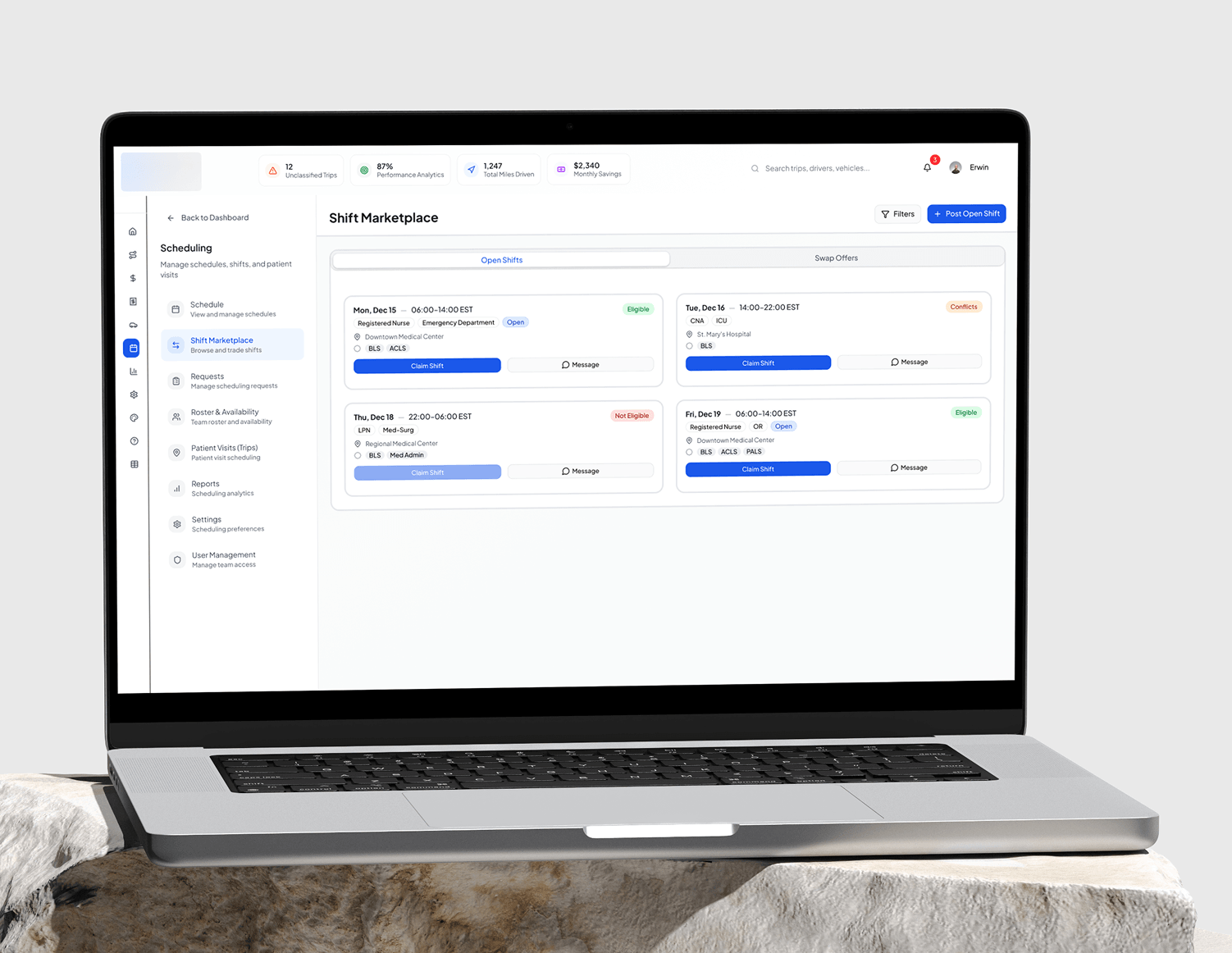
Shift Marketplace
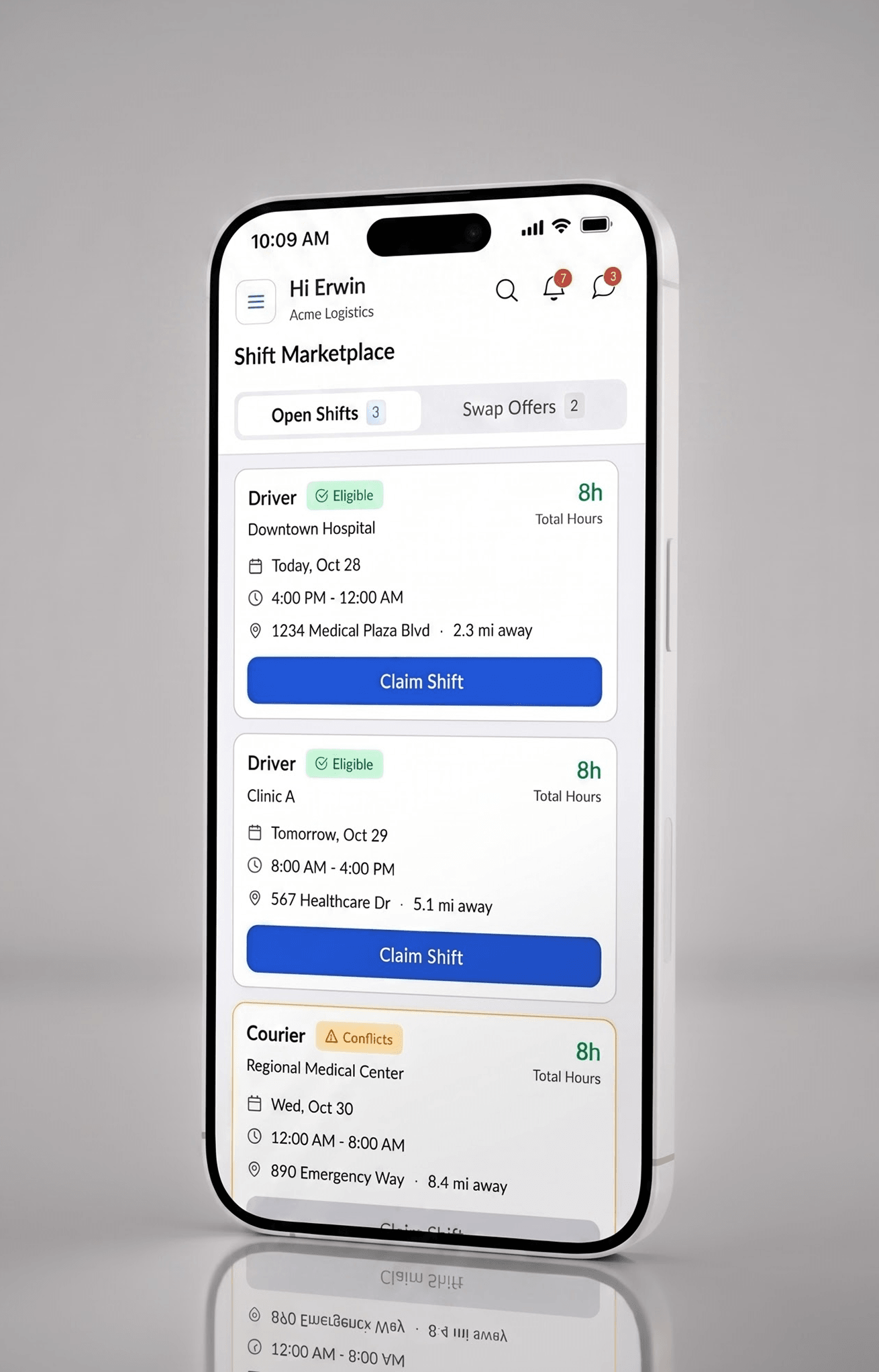
Open Shifts and Swap Offers. Each card shows role, unit, facility, times, and required credentials, and is stamped Eligible, Conflicts, or Not Eligible, with the claim button disabled on the last.
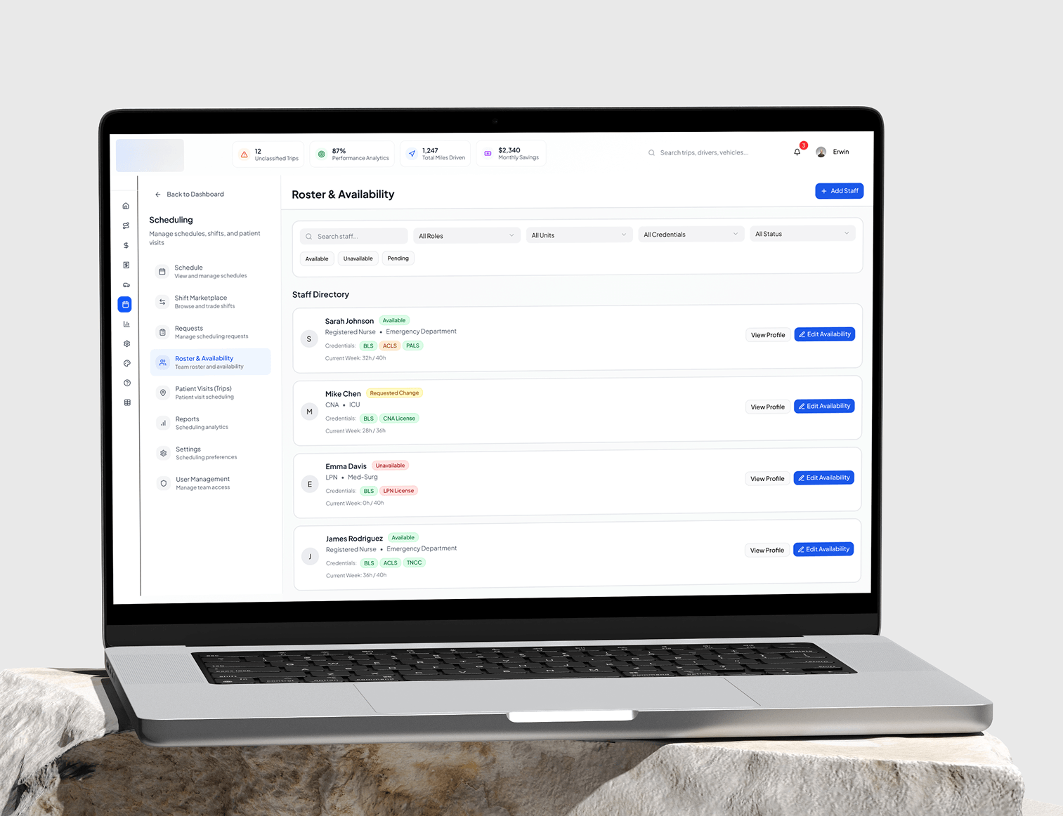
Roster and Availability
Credentials per person, BLS, ACLS, PALS, CNA and LPN licences, availability state, and weekly hours against a cap, for example 32h of 40h.
Patient Visits
Address, scheduled time, assigned staff, care type, and status tags including Missing Inputs on incomplete visits. The documentation gap made visible inside the product.
Dashboard · Personal
The logistics and field services product
Trips
A table with route, distance, duration, business or personal classification, vehicle, and tags, plus an unclassified state the product actively chases.
Expenses with AI insights
Including a Top Reimbursement Delay Reasons breakdown: missing receipts, incorrect mileage, category errors.
Reimbursements
Claim status, receipt attachment state, trip linking, and a longest-pending indicator.
Personal Analytics
A compliance ratio and AI-generated trend summaries.
Mobile web app · Frontline workers
One action, the current moment
Onboarding
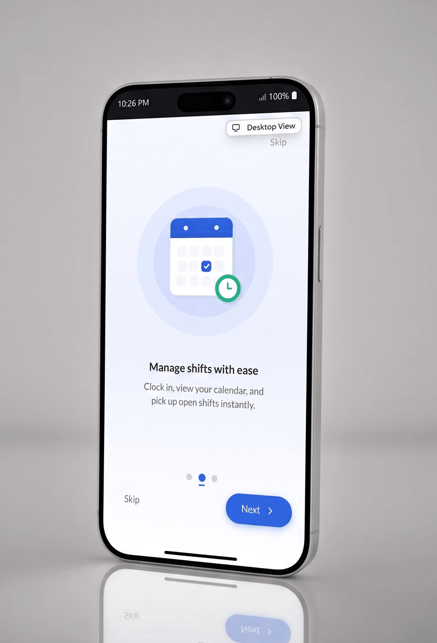
A three-slide carousel, then a terms screen covering service agreement, data usage and privacy, and GPS tracking permissions.
Five-tab navigation
Home, Trips, Time, Expenses, More.
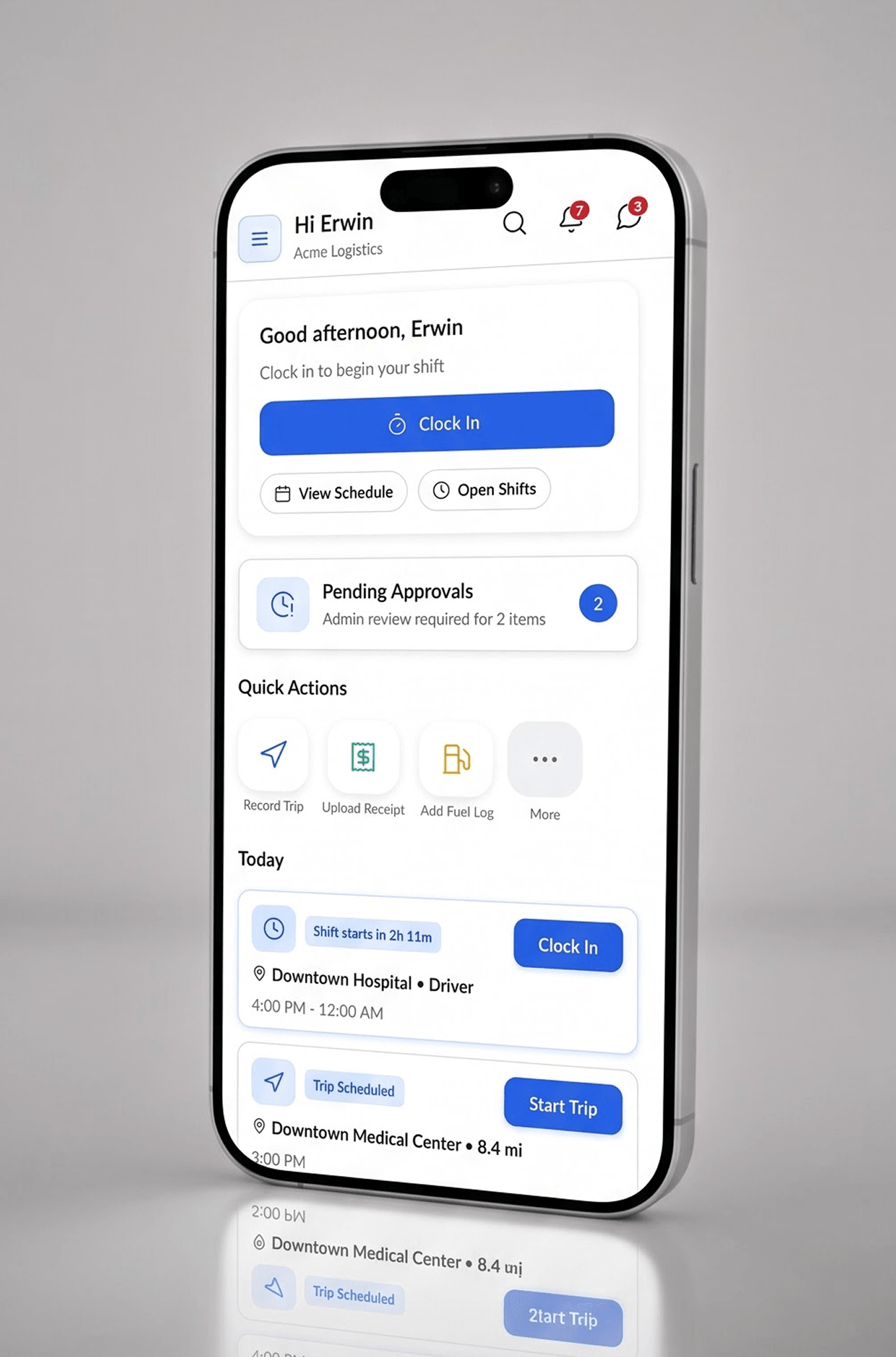
State-driven Home
Greeting, primary Clock In, View Schedule and Open Shifts secondary, an Auto Track toggle, a Pending Approvals count, and Quick Actions.
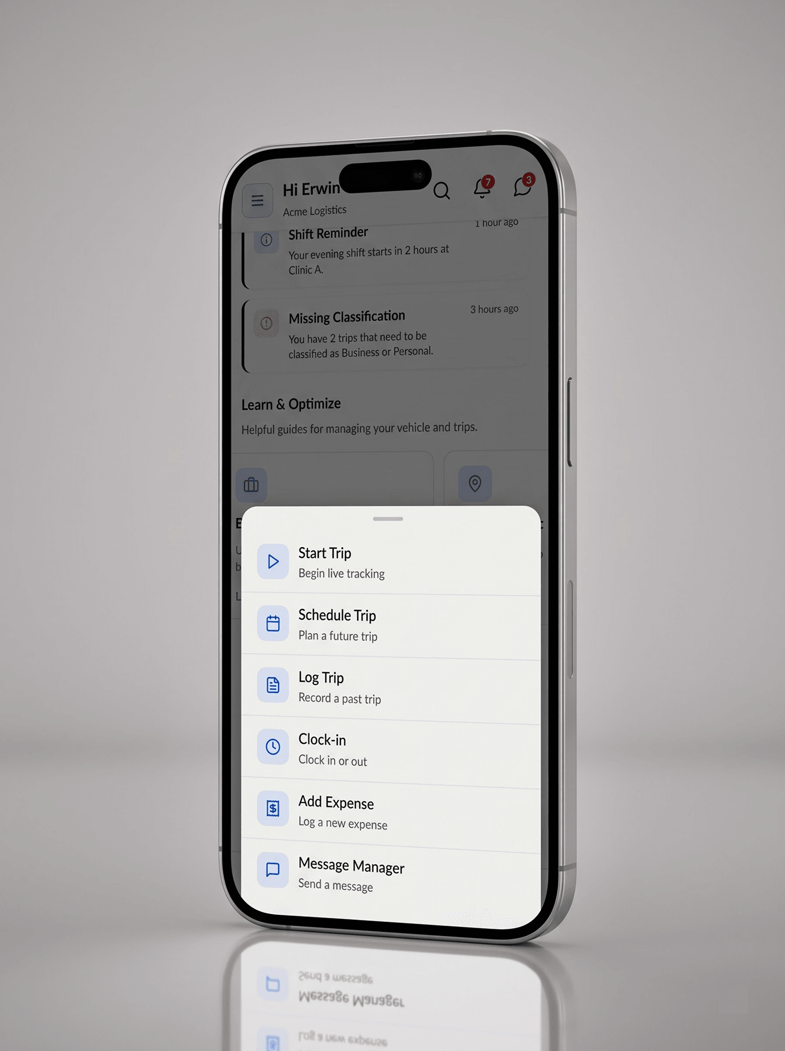
Floating action button
Opens a sheet: Start Trip, Schedule Trip, Log Trip, Clock-in, Add Expense, Message Manager.
Time
Calendar, Create New Shift with GPS tracking ready, and Open Shifts Near You carrying first-come-first-serve labels and expiry countdowns.
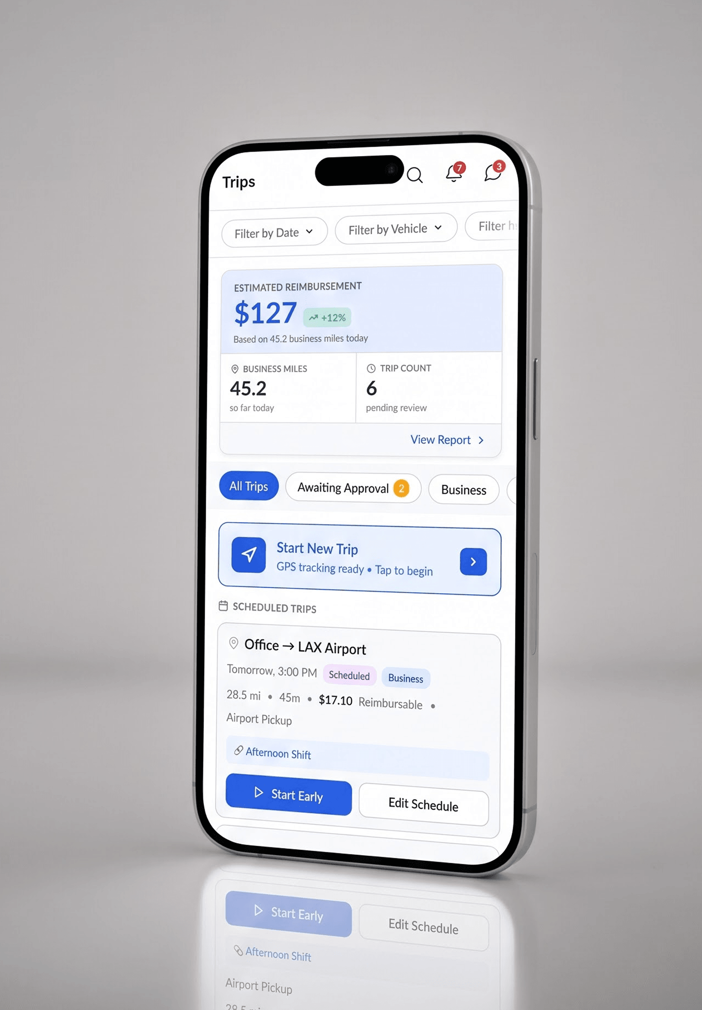
Trips
Cards with route, status, business or personal classification, site, distance, duration, and reimbursable amount.
Messaging
Conversations filtered by All, Unread, Pinned, Approvals and Trips, with individual and group threads by role.
Settings
OCR and autofill preferences, vendor and merchant presets, expense tagging policies, shift preferences, break rules, notifications, permissions.
The screens
One screen is annotated in full, because it carries the compliance argument of the whole case study; the rest describe themselves.
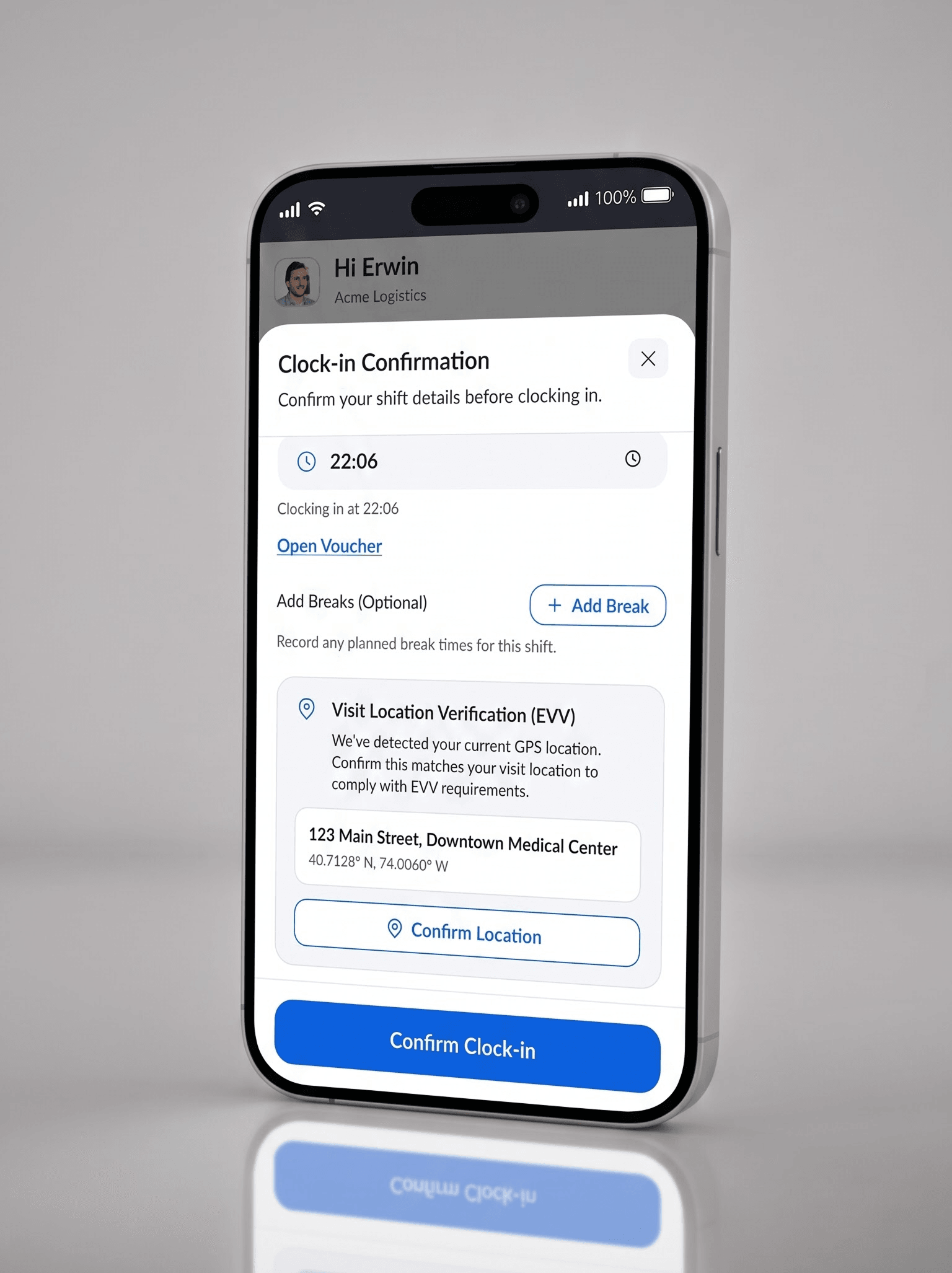
The proof screen
Clock-in Confirmation, with EVV verification
The sheet assembles the shift context before the shift starts: employee, organisation site, and scheduled start against actual time, with an Open Voucher link and optional break planning.
The Visit Location Verification block reads "We’ve detected your current GPS location. Confirm this matches your visit location to comply with EVV requirements", above the detected address and coordinates.
Confirm Location, then Confirm Clock-in. Two deliberate taps between the worker and an on-duty state, so a wrong reading surfaces at the only moment it can still be corrected.
Dashboard
Mobile web app
Before and after
Before
After
Schedule confirmations lived in a WhatsApp group
Real-time roster and weekly shift calendar
Clock-in was a paper sheet at a nursing station
EVV-compliant clock-in with GPS confirmation
Receipts sat in a personal camera roll
One-tap expense capture with OCR autofill
The timesheet was filled by hand
Trip recording, offline sync for every critical action
A physical supervisor signature
Six EVV data elements captured at the visit
One system, one handoff
The system is built as semantic tokens rather than raw values: colour carries meaning, available, understaffed, verification-pending, so a status reads identically on a dense desktop table row and a full-width mobile card. Component primitives are shared; density, sizing, and layout diverge above that layer.
The final prototype was built as working front-end, so instead of a specification describing intended behavior the engineers had a running artifact demonstrating it. Interaction timing, empty states, offline behavior, and the state-dependent FAB were all things they could open and use rather than infer from a redline.
Reflection
What I would do differently
Recruit at least some participants independently.
Every person we spoke to came through the client’s network. That access was the reason the research happened at all on this timeline, and I would take it again. But people introduced by the person building the product are systematically more receptive to it than a cold-recruited group. I did not have a counterweight to that, and I should have pushed for two or three participants sourced outside his circle purely as a check on the pattern.
Define the measurement before the build, not after.
We designed against qualitative accounts of what was slow and what was painful. Those accounts were credible and consistent, but I never instrumented the questions they raised. I should have specified, during design, exactly what we would measure post-launch: time from shift end to invoice-ready, EVV exception rate, percentage of expenses captured in-app versus outside it. I am retrofitting that measurement now rather than then.
Observe rather than reconstruct.
The one-handed constraint was the most important input into the mobile design, and I arrived at it through description rather than observation. Everything about it held up, but I was designing for a physical context I had only heard about. Even one shadowing session would have changed how confident I am in those decisions.
What is still weak
Offline conflict resolution.
Critical actions work offline and sync on reconnect, which is correct. What is underdesigned is what happens when a worker's offline record and a coordinator's server-side change disagree. It works for the common cases and I am not confident it works for the uncommon ones.
The analytics surface is the thinnest part of the product.
It answers what happened. It does not yet help a coordinator decide what to do about it. It shipped as reporting because reporting was scopeable in 16 weeks with 2 engineers, and I would rather say that plainly than present it as finished thinking.
Zero-training was a design goal, not a verified outcome.
The mobile flows were built so a worker could complete a full shift cycle without instruction. Round one of pre-launch testing supports it; whether it holds across the real range of workers, devices, and conditions is still open.
What comes next
Native iOS and Android apps to replace the current web-based mobile view, enabling background GPS and automatic trip detection, the last manual step in mileage. AI-assisted shift recommendations from historical coverage patterns. A stricter HIPAA handling mode for healthcare deployments with tighter data requirements. The data layer and component architecture were built assuming these would arrive.
The full product walkthrough runs about 30 minutes and covers every module. Happy to walk through it directly.